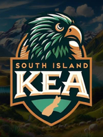
Why did they rebrand? Was there a reason? This new logo looks insanely busy and cant tell what you are even looking at. Imagine that same logo at a smaller resolution. They will just resort to using KEA part.
Good luck to them but they just look so amateurish.
I am 95% sure that their old logo was
heavily put together with AI

This is the profile picture they use on Facebook, the background of course is AI but if you look at the logo itself the text is all jagged and the shadowing of it is all different colours, looks like it is fading in one spot if you look in the hole of the ‘A’.
At the top of the head there is a weird flick of that bronze colour, and something has gone wrong with the feathers just to the left of that. Above the ‘A’ in South Island there is just a hole in the feathers
The South Island at the bottom of the logo is ripped straight from Google if you just search “South Island NZ outline” too.
The background of the logo, behind the head has this weird thing going, I don’t know if it is meant to be wings or mountains but whatever it is, it’s asymmetrical and looks super fishy.
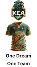
Going on a bit of a tangent here, but this is what Moffett put up on his LinkedIn..

..The logo, the jersey mock up (also AI) on a white word doc with “One Dream, One Team” in Arial? Fmd haha, clearly they have no designer or real marketing person.
You are 100% on the new logo, it’s a nightmare. It took me 15 seconds to find the Kea when I saw it the first time and that was when it was blown up.
At least they probably paid someone on fiverr for something original this time around ig?


