Support Feature - Light/Dark Mode

tajhay

💙💚❤️
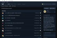
You can now use the site in light or dark mode.

Light Mode - Default
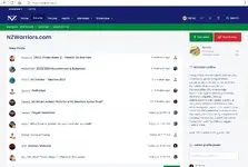
1693970657950.png

Dark Mode
1693970748482.png

Both styles are pretty minimal for a reason and will be worked on further during the offseason. Those who have tried the dark mode prefer it for night time reading.

How to switch between Light and Dark modes.
On desktops there will be a lightbulb icon you can click to switch to the other mode (if already in light mode, itll take you to dark, and vice versa).
1693971107875.png

On mobile devices, this is on the menu that is activated by the canvas menu which is next to the site logo. Once there, at the bottom you will see the lightbulb icon and whether and what it will be switched to.
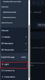
1693971318086.png
 
NZWarriors.com
NZWarriors.com
Advertisement
If you would like to remove these advertisements, please do so by registering a free account
You can now use the site in light or dark mode.

Light Mode - Default
View attachment 343

Dark Mode
View attachment 344

Both styles are pretty minimal for a reason and will be worked on further during the offseason. Those who have tried the dark mode prefer it for night time reading.

How to switch between Light and Dark modes.
On desktops there will be a lightbulb icon you can click to switch to the other mode (if already in light mode, itll take you to dark, and vice versa).
View attachment 345

On mobile devices, this is on the menu that is activated by the canvas menu which is next to the site logo. Once there, at the bottom you will see the lightbulb icon and whether and what it will be switched to.
View attachment 346

I love dark mode - thank you!
 
NZWarriors.com
Advertisement
If you would like to remove these advertisements, please do so by registering a free account
Theres a few people here that use Dark Mode. If you do use it (even if it occassionally), could you please heart (😍) this post if you are willing to test upcoming changes, and can probably suggest things that can look better.

Also heart this post if you want to give feedback on Light/Default mode for example if font size is too small/too large, colours are hard on eyes, anything from an accessibility point of view.

I will contact the people willing to provide feedback over the offseason whilst that work is done.

Boring tech info below:
Reason for asking is that forum will be updated for new season. Theres a lot of updates on the backend but not so much for users/usability , but things that will be improved will be:
- totally new post editor
- passwordless logins (authentication via FaceID/keys like you may access more secure apps like internet banking apps). This is a far more secure method than using passwords.
- better embedding of content (i personally really dislike how content copied from other forums is shown in a really bad way which is hard to follow). Things will make more sense now when Noitall copies posts from other forums lol. Even posting a link to a post will make more sense and more readable.
- Style changes. One of the reasons why i dont work on dark mode is primarily because it doubles the effort to maintain it. Everything is done on the default style (light mode) and then reijigged for dark mode. However there are lots of places where this has not been done. There is now a cleaner method where all work is done on one style (not 2 i.e. light and dark for example). You will still have dark/light/ (and system...based on your device settings....i.e. some people at nighttime automatically have their devices goto dark mode for better readability in the dark).
 
Theres a few people here that use Dark Mode. If you do use it (even if it occassionally), could you please heart 😍this post if you are willing to test upcoming changes, and can probably suggest things that can look better.

Also heart this post if you want to give feedback on Light/Default mode for example if font size is too small/too large, colours are hard on eyes, anything from an accessibility point of view.

I will contact the people willing to provide feedback over the offseason whilst that work is done.

Boring tech info below:
Reason for asking is that forum will be updated for new season. Theres a lot of updates on the backend but not so much for users/usability , but things that will be improved will be:
- totally new post editor
- passwordless logins (authentication via FaceID/keys like you may access more secure apps like internet banking apps). This is a far more secure method than using passwords.
- better embedding of content (i personally really dislike how content copied from other forums is shown in a really bad way which is hard to follow). Things will make more sense now when Noitall copies posts from other forums lol. Even posting a link to a post will make more sense and more readable.
- Style changes. One of the reasons why i dont work on dark mode is primarily because it doubles the effort to maintain it. Everything is done on the default style (light mode) and then reijigged for dark mode. However there are lots of places where this has not been done. There is now a cleaner method where all work is done on one style (not 2 i.e. light and dark for example). You will still have dark/light/ (and system...based on your device settings....i.e. some people at nighttime automatically have their devices goto dark mode for better readability in the dark).
I use exclusively use dark mode on iOS.
 
Back
Top