Navigation
Install the app
How to install the app on iOS
Follow along with the video below to see how to install our site as a web app on your home screen.
Note: This feature may not be available in some browsers.
More options
You are using an out of date browser. It may not display this or other websites correctly.
You should upgrade or use an alternative browser.
You should upgrade or use an alternative browser.
General 2025 NZ Warriors Jerseys and Merchandise
- Thread starter mt.wellington
- Start date
Wellington Warrior
⭐
Rating Guru
Home kit needs white shorts hate the all blue!! Also not a fan of the away jersey (aka Auckland NPC)
WahsaurusRex
❤️
Heart Stealer
The “Paua” Warm Up tees are tenfold better than the “Black Sand” training gear, sucks they didn’t just do that theme throughout
I do like that Dynasty obviously listen to what the fans want though; Everyone was clamouring for the jersey with the Warriors logo “grip” this time last year so they released the player issue kit, and this year they have just sublimated it into the replica jersey
I think it looks bad personally, combined with the new Dynasty jersey template it looks like a rip off, but it’s what the people want


juju
🔥
Streak Master
I think the 2025 Warriors range is still much better than the other Dynasty Teams ranges.
Manly's for instance is pretty bland.
View: https://www.instagram.com/p/DCSMX1iTXj-/?hl=en&img_index=1
Manly's for instance is pretty bland.
View: https://www.instagram.com/p/DCSMX1iTXj-/?hl=en&img_index=1
Yeah there’s always the weird grey area between eg 30 years and 30th season that always gets debated lol only time I remember us doing anything was the 20th season half half logo?The Cowboys jerseys has a 30 years logo.
Surely both teams joining the same year would celebrate their anniversaries the same year.
Stalefish540
👍
Quality Poster
I grabbed the warm up tee. I'm pretty plain Jane, but even I thought the training tops were bland.The “Paua” Warm Up tees are tenfold better than the “Black Sand” training gear, sucks they didn’t just do that theme throughout
I do like that Dynasty obviously listen to what the fans want though; Everyone was clamouring for the jersey with the Warriors logo “grip” this time last year so they released the player issue kit, and this year they have just sublimated it into the replica jersey
I think it looks bad personally, combined with the new Dynasty jersey template it looks like a rip off, but it’s what the people want

Warm up tee and 3x pairs of the '25 black socks. That will do me for another year.
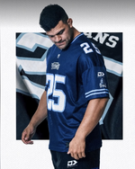
I like the idea, but that is a shit job by the Titans.What do u guys think of this titans American football style shirt?
View attachment 10030
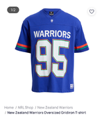
I reckon a warriors version could be a big seller.
Or have they already done this?
For the Warriors I can see a dark blue top with red and green outline to the numbering and sleeves and it would look pretty cool. I'd buy it.
I'd feel hard done by if I was a Titans fan though.
Sure, but less shit
WahsaurusRex
❤️
Heart Stealer
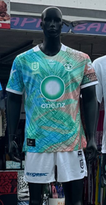
Just doesn’t look like a Warriors Jersey somehow for mine.Pasifika Jersey revealed at the Otara Markets this morning; not sure if it is just a trial kit or not
View attachment 10412
Was gonna say the colours look off but technically they’re Green, Blue, Red and white but just odd shade choices etc
juju
🔥
Streak Master
I know what you mean, the vibe doesn't quite feel right with that one. I'm sure I'll come around to it eventually though.Just doesn’t look like a Warriors Jersey somehow for mine.
Was gonna say the colours look off but technically they’re Green, Blue, Red and white but just odd shade choices etc
They have had mostly hits with the jersey designs so far but that's a miss for me.Just doesn’t look like a Warriors Jersey somehow for mine.
Was gonna say the colours look off but technically they’re Green, Blue, Red and white but just odd shade choices etc
Also just very very busy the eye just keeps darting around not knowing where to focus. Not a fan of this oneI reckon what’s different is the scheme of blue, green and red are more pastels than the bold blue, green and red traditionally used
Similar threads
- Replies
- 159
- Views
- 19K
- Replies
- 30
- Views
- 6K
- Replies
- 23
- Views
- 7K
- Replies
- 18
- Views
- 5K
- Replies
- 7
- Views
- 4K


