Navigation
Install the app
How to install the app on iOS
Follow along with the video below to see how to install our site as a web app on your home screen.
Note: This feature may not be available in some browsers.
More options
You are using an out of date browser. It may not display this or other websites correctly.
You should upgrade or use an alternative browser.
You should upgrade or use an alternative browser.
NRL Canterbury-Bankstown Bulldogs
- Thread starter WahsaurusRex
- Start date
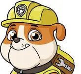
"Temu Paw Patrol" did make me laugh.I don’t know why this made me laugh- looks a bit paw patrolish?
It’s the overly droopy cheeks, they cartoonise (new word, unregistered lol) the logo.I don’t know why this made me laugh- looks a bit paw patrolish?
I think their old logo is already pretty shit so I'm not sure this is any worse.
It will take some getting used to as initial thoughts looking at it on the jersey it looks weird. I was listening to the Levels Network podcast yesterday, Willie Mason "A logo needs to look good on the merchandise, I've seen the new merchandise and it suits". He's probably been looking at it for a while.
It looks like a logo that would look good on the side of the Leagues Club.
It looks like a logo that would look good on the side of the Leagues Club.
Apparently the old boys i.e. Mason, James Graham had seen it for a while. He was trying to talk of the positives i.e. the 'first bulldog logo that is looking directly at the person looking at it' lolIt will take some getting used to as initial thoughts looking at it on the jersey it looks weird. I was listening to the Levels Network podcast yesterday, Willie Mason "A logo needs to look good on the merchandise, I've seen the new merchandise and it suits". He's probably been looking at it for a while.
It looks like a logo that would look good on the side of the Leagues Club.
Its a tough ask to design a bulldogs logo though. Probably shoulda gone for a flatter minimalist design so it looks good at all different sizes.
mongrel mob seem to have it sussed?Apparently the old boys i.e. Mason, James Graham had seen it for a while. He was trying to talk of the positives i.e. the 'first bulldog logo that is looking directly at the person looking at it' lol
Its a tough ask to design a bulldogs logo though. Probably shoulda gone for a flatter minimalist design so it looks good at all different sizes.
Maybe they should change their colours from blue and white to black and red.mongrel mob seem to have it sussed?
Who is gonna tell em?mongrel mob seem to have it sussed?
Who is gonna tell em?
-
Nobody is reading this thread right now.
